Wednesday, November 10, 2004


Falconess
14x17, pastel with colored pencil and inks on bristol
I saw this as a sketch somewhere (can not remember where or by who), but I simply had to recreate it. It was done at a time when I was fascinated with using simple geometric shapes to help frame, but not limit the picture. Posted by Hello

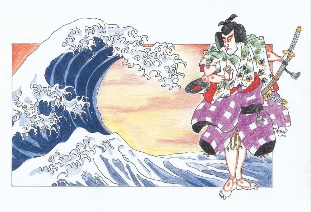
Ronin
14x17, pastel with colored pencil and inks on bristol
When I went to Japan for the first time and wanted to bring back gifts, I bought a bunch of tee shirts. These were two of the most common images that I found, Fujisan and a samurai. I called this piece Ronin as a play on words. Ronin, aside from being a masterless samurai, means “wave-person” since they were considered to be, literally, free as a wave. I thought myself quite clever by combing these two images. Posted by Hello

Tuesday, November 09, 2004

HaloScan

I am hoping that by installing the HaloScan comment system that I have seen on other blogs should make adding comments easier. But as usual, I am confused as to whether it is working properly. Crap!! :(
Haloscan commenting and trackback have been added to this blog.

Monday, November 08, 2004

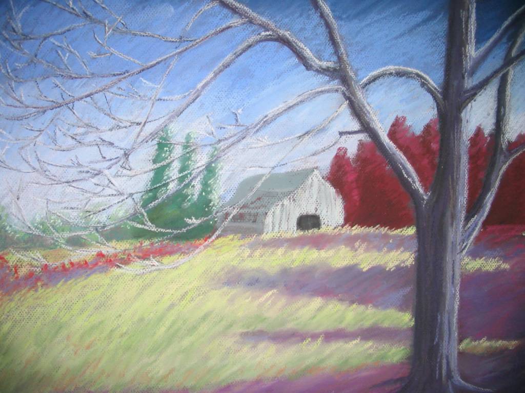
Summer by the Tree

It was not this summer and it was not this tree, but there was a summer and there was a tree...

I definitely liked the idea of posting pictures before they are completely finished, especially when many of my paintings need to "age" for a while before I feel they are completed. In this case, I am not sure if this is the finished product or if I will do some radical re-working in certain areas. I am leaning toward the latter and will probably spray it with workable fix and procede from there. In the interim, I have started another painting and will post pictures of it as it progresses.

Summer by the Tree
12x16, pastel on Canson Mi-Teintes Posted by Hello

Friday, October 29, 2004

Still Untitled

As I have mentioned before, one of the hardest parts of the painting process for me is naming the final piece. This one is still untitled even thought it has been matted and framed (another thing I hate doing is picking out a matte before framing). I had something for this that I thought I liked, but after thinking about it some more, I really did not like it. Mostly, my choice of a titled is fairly generic "Cheetah after the kill" or "Horst Study #1" but I would really like to be able to find a title that embodies the painting. So far, easier said than done.

So, anyone have any suggestions for this? Does it say anything to you? Comments and suggestions would be appreciated.

Still Untitled. . .16x20, pastel on Canson Mi-Teintes board Posted by Hello

Tuesday, October 26, 2004

Old Pencil Drawings

As I am waiting to finish my latest pastel painting (yes! two paintings in one month, I must be inspired!) I thought it might be cool to post some older pencil drawings. The first (Her Stare) was done when I was 17 while the second (Koriand'R vs. Komand'R) was done at the ripe ol' age of 12. Sometimes I look back at my older pencils from around that time and I think this was the height of my drawing ability. It is certainly the most prolific period (I have a box full of sketch books that are brimming with all sorts of sketches and drawings). The reason I think that it may have been the height of my drawing ability was because when I was 12-13, there was nothing that I thought I could not draw. I was definitely more fearless. Now, I chose my subject matter with a certain bit of care. Today, my painting skill has certainly improved, but my drawing skill. . .well, it may just be a bit rusty.

Koriand’R vs Komand’R
9x12, pencil on paper
Holy Crap. I was only twelve years old when I drew this and it isn’t even a swipe. I am quite proud of this picture. Go Teen Titans! Go! Posted by Hello

Her Stare
9x12, pencil on paper Posted by Hello

Monday, October 04, 2004


Reflections at the Mountain’s Edge
9x12, pastel on paper
Before continuing, the painting was sprayed with Workable Fix to add more tooth to the surface. This final step was completed primarily with Unisons, but some Schminckes were also used. Since I wanted this piece to have some energy, I left the pastel strokes evident in the sky, instead of trying to make the sky look “atmospheric” by blending the colors. After several failed attempts with the lake, I decided that the simplest decision was the best, and it too became a reflection of the sky. Finally, greater detail was added to the mountain slope.
The hardest part for me, aside from starting, is to name the final painting. After trying several very lame alternatives, I settled on “Reflections at the Mountain’s Edge.”  Posted by Hello

Third Step
9x12, pastel on paper
Using Unisons, I reshaped the outline of the mountains and blocked in the colors for the sky. I also redrew the reflection of the mountains that I noticed was not even close to being a mirror image. The mountains in the far background were given some shadows to draw to make them more distinct. Again, the water was changed, this time to a darker, deeper purple. It was better than the red, but I was still unhappy with the result.
 Posted by Hello

Second Step
9x12, pastel on paper
Here I begin to use my trusty ol’ Rembrandt pastels, blocking in colors. The dark areas begin to be defined and the mountains start to take shape. I chose reds for the water, not sure why, but I was very unhappy with the results. The water would be changed several more times before the finished painting. Posted by Hello

First Step
9x12, pastel on paper
I wanted this piece to have some energy, so I chose orange colored paper, the complimentary color of blue, which was the primary color of this piece. Normally, I start with a value drawing in charcoal, but I had recently bought a set of Nupastels. These hard pastels are very good for an underpainting. At this stage, it is a very rough drawing, with only suggestions of where everything is going to be. Posted by Hello

Sunday, October 03, 2004

Thursday, September 30, 2004

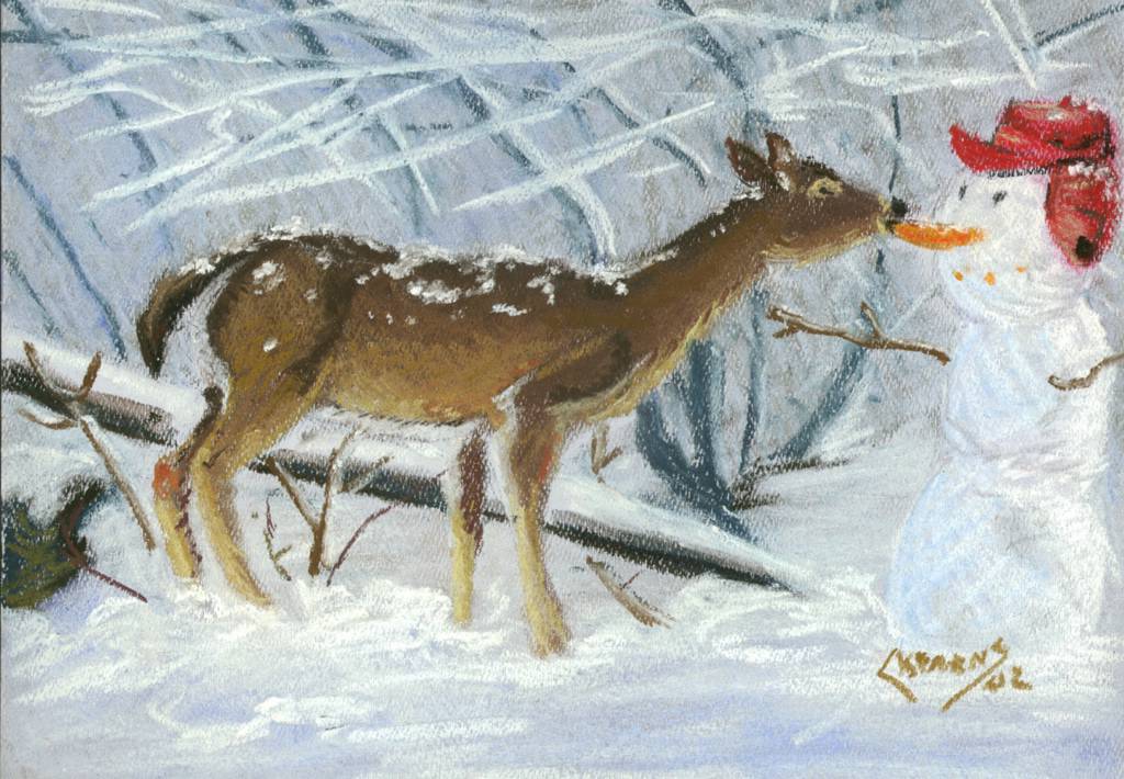
Winter Treat

I always hear about deer eating peoples' gardens, but stealing the nose from frosty? C'mon, that is just plain wrong.

This marks the first time that I used Schmincke pastels. Can you say, "like buddah?"

Winter Treat
9x12, pastel on paper Posted by Hello

Wednesday, September 22, 2004

Thursday, September 16, 2004

Caught in the Moment

More an experiment than anything else, and, unfortunately, an experiment with more failures than successes. I am told that most people find the girl to be rather ugly. And some have mistaken the identity of the subject (she is from the cover of a catalogue). What I do like is the details in her hair and eyes achieved by layering with workable fix.

Caught in the Moment
12x16, pastel on Canson Mi-Teintes Posted by Hello

Monday, September 13, 2004

And now, back to paintings

The original reason for this blog was to post my pastel paintings, but then I realized that I had a lot of other pictures that I wanted a place for as well. It has been fun going through my personal archives and finding some older and sometimes forgotten work (I have a pencil sketch from when I was 13 that I absolutely must post). But now it is time to go back to some of my pastels.

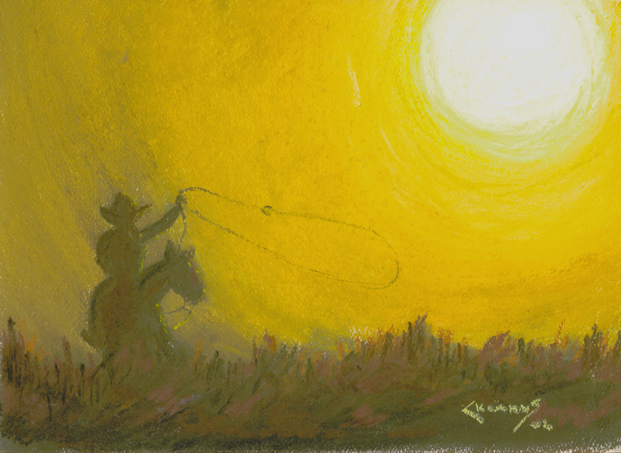
"Cowboy Take Me Away" resulted from my desire to play with softer pastels, like Sennlier. So, I broke down and spent the money (they ain't cheap like me) and bought a set.

Wow!

To think I missed out on using these for so many years. What a difference. I have since bought several sets of really expensive Unison and Schmicke. And they have been worth every penny. What a joy to use these soft as butter pastels over my trusty Rembrant.

Cowboy Take me Away
9x12, pastel on paper Posted by Hello

Saturday, September 04, 2004

Body Builder (Unfinished)

Continuing with a trend, here is another sketch of a body builder (I think it may be Dorian Yates). Looking at this and all the cross-hatching, I can cleary see the influence of Frank Miller's Ronin on my earlier work. I have many old sketch books and pads filled with drawings of figures. Some detailed and some rough. I think that it was my interest in figure drawing, my interest in figuring out how all the muscle worked and were shaped that lead to my interest in physiology. Even as a small child I was thinking about Structure and Function.

Body Builder (unfinished)
11x14, pencil on paper Posted by Hello

Thursday, September 02, 2004

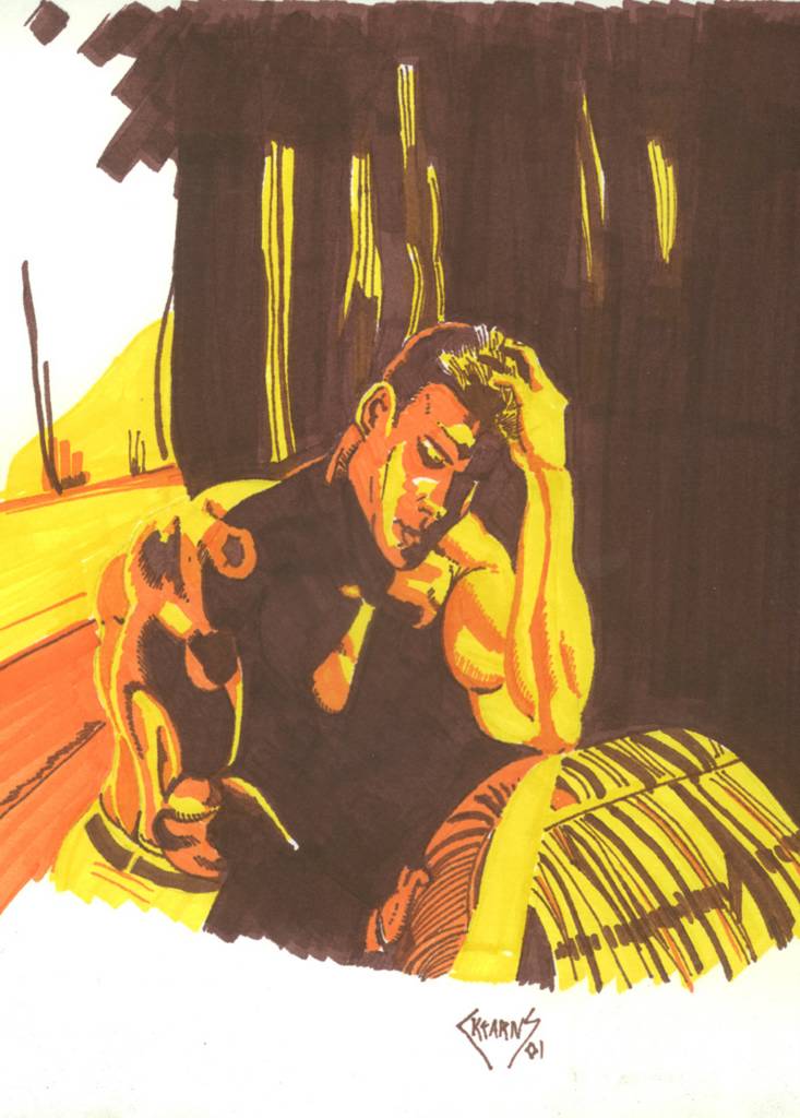
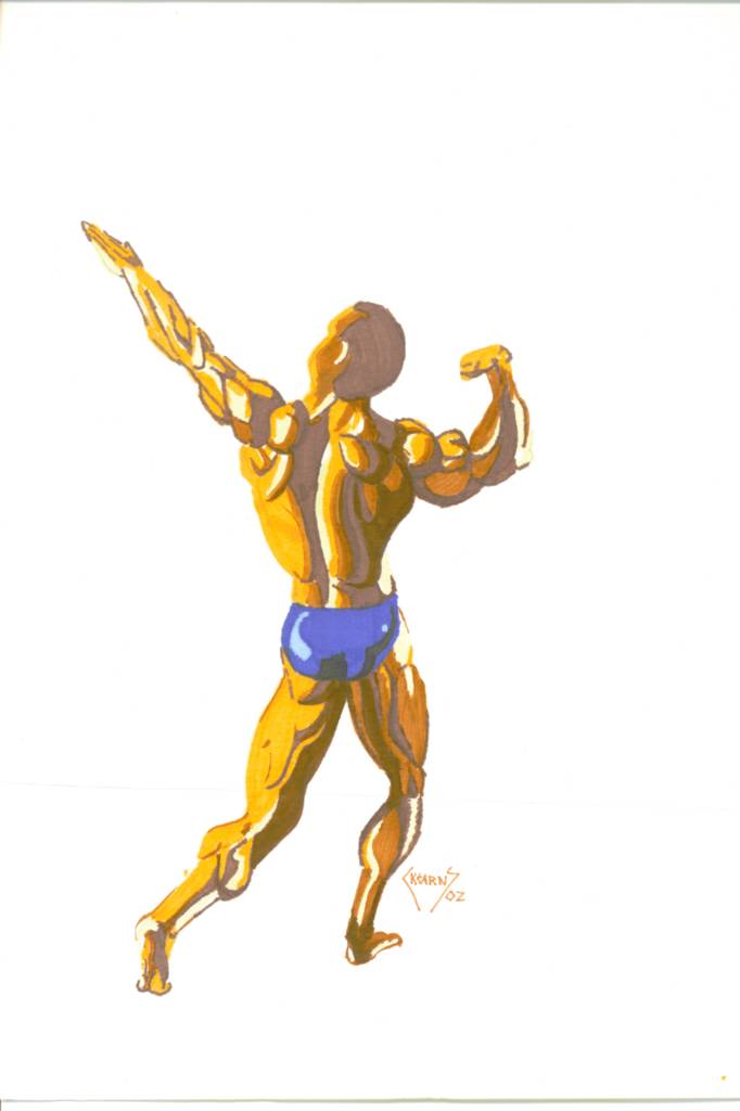
More Markers

More fun with markers, this time Prismacolors. A triptych of bodybuilders was supposed to be the theme, but I never really finished "The Pose". Just another case of indecision as to what I wanted for the background, or probably more accurately, a case of me not wanting to draw a background.

The Thought
9x12, Prismacolor markers on bristol Posted by Hello

Contemplations of Power
9x12, Prismacolor markers on bristol Posted by Hello

The Pose
9x12, Prismacolor markers on bristol Posted by Hello

Wednesday, August 25, 2004

Horse Studies in Marker

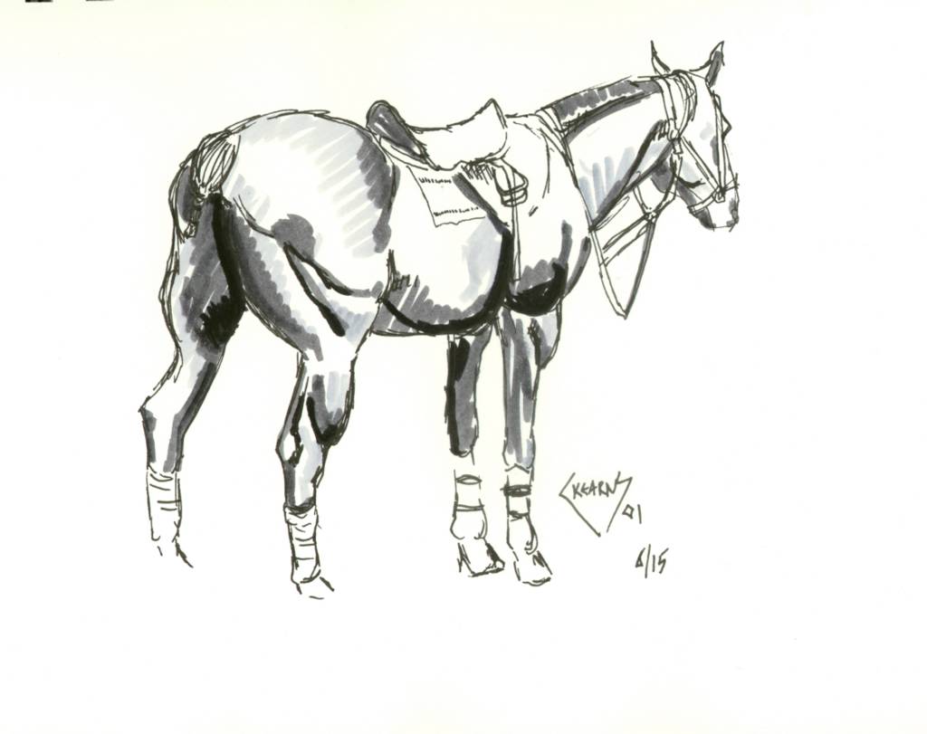
A friend of mine showed me these amazing pictures in his sketchbook and I was amazed to find out that they were not washes. No. They were done with markers! I just had to try. These markers are a wonder. All the fun and depth of wash with out any of the mess. These were very fun pieces to do. Each Study was done quickly in a loose style, usually in one sitting.

One day I might have to paint Study #1 in pastel. I just love the energy of that piece. Study #3 captures the power and musculature of these wonderful animals. Look closely at Horse Study #4, you can see the braided tail. My horse expert friends correctly surmised this was based on a polo pony. I knew that (really).

Horse Study #1
9x12, markers on Bristol paper Posted by Hello

Horse Study #2
9x12, markers on Bristol paper Posted by Hello

Horse Study #3
9x12, markers on Bristol paper Posted by Hello

Horse Study #4
9x12, markers on Bristol paper Posted by Hello

Thursday, August 12, 2004

Across the Tundra

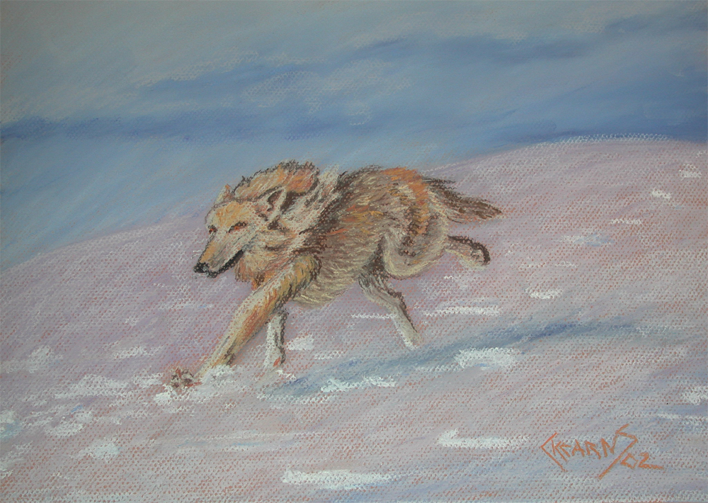
Complimentary colors tend to “vibrate” when placed side by side, to produce the illusion of motion. I chose orange paper for this painting in mostly blue. My entire goal with this picture was to achieve a feeling of motion, a lone wolf sprinting across the barren snow.


Across the Tundra
12x16, pastel on Canson Mi-Teintes
 Posted by Hello

Wednesday, August 11, 2004

Cheesecake

Instead of posting these separately, I decided to make a collage of several of my "cheesecake" pictures. Two of my biggest influences are Frank Frazetta, Royo and Oliva and hopefully that is apparent with these images. Frazetta worked primarily in oil, Royo in anything he wanted while Oliva used water color. Me? I used mixed media for my cheesecake, pen and ink with colored pencil and pastels.

Cheesecake- mixed media Posted by Hello